Key Takeaways
- Outputs vs outcomes: Outputs prove activity; outcomes prove change. Funders now pay for outcomes, but most reports still lead with outputs.
- Measurement gap: India's CSR spend has topped ₹2.61 lakh crore since 2014, yet only ~1 in 5 nonprofits feel effective at proving outcomes.
- Track one metric: Pick the single outcome your program depends on and track it weekly for 90 days, not ten scattered metrics.
- Honest data wins: Educate Girls used mid-course data to fix its model, hitting 160% of its target in the world's first education impact bond.
- One framework, used well: Start with a Logic Model, pull metrics from GIIN's free IRIS+ catalogue, and add SROI only when funders require it.
- Simple tools beat unused platforms: A weekly Google Form beats a quarterly-checked ₹5 lakh dashboard. Upgrade tools only when data outgrows a spreadsheet.
- Regulation, not choice: Social Stock Exchange listings require an audited Annual Impact Report covering at least 67% of program spending, per SEBI rules.
I've sat across the table from people who built a brand-new school, wrote the cheque, cut the ribbon, took the photos and then watched dropout rates stay exactly where they were. I've seen a team hand out thousands of water filters and celebrate the number, only to find, a year later, that community health hadn't moved at all.
Here's the uncomfortable lesson I've had to learn the hard way: wanting to do good isn't the same as doing good. And the only way to tell the difference is to measure the right thing.
That's what this guide is about. Not paperwork. Not compliance theatre. Social impact measurement is the discipline of drawing a straight line from what you did to what actually changed in someone's life and having the evidence to prove it.
The money on the table is enormous. Indian companies have now poured more than ₹2.61 lakh crore into CSR since the law took effect in 2014-15, according to figures compiled from the Ministry of Corporate Affairs' National CSR Data Portal and the Bharat CSR Performance Report 2026. In a single decade, annual CSR spending has more than tripled. But almost none of that money comes with a credible answer to one question: did it work?
We have gotten very good at counting what we spend. We are still terrible at measuring what we change. This guide is our attempt to close that gap.
The State of the Sector, in Numbers
Before the how, the why. A few data points that explain why this topic went from "nice to have" to "non-negotiable":
| ₹2.61 lakh crore | ₹40,794 crore | 2.47× | ~55% | 76% vs ~20% |
|---|---|---|---|---|
| Cumulative Indian CSR spend from FY2014-15 to FY2024-25 | CSR spend in FY2024-25 alone—a record 17% YoY increase across 72,233 projects and 29,546 companies | Growth in annual CSR spend since FY2014-15's ₹10,066 crore | Combined share of CSR going to education and healthcare, up from ~44% a decade ago | 76% of nonprofit leaders rank outcome measurement as a top priority, but only ~20% feel very effective at demonstrating outcomes |
What Is Social Impact Measurement?
Social impact measurement is the systematic process of collecting, analysing, and reporting the social, economic, and environmental changes that result from an organisation's work. It goes beyond counting outputs (how many people you served) to assess outcomes and long-term effects (how their lives actually changed).
Put more plainly: it's how you find out whether you're really helping, so you can make decisions on evidence instead of hope.
A CSR report can proudly announce "we spent ₹500 crore on community development." Impressive number. But what does it mean on the ground? Did a child get healthier? Did a family climb out of poverty? Traditional, spend-focused reporting completely misses that question, and that question is the entire point.
Measuring what matters isn't about counting what's easy to count. It's about having the nerve to look past the numbers and ask: did we create a ripple, or just make a splash?
The best measurement blends two things that most organisations keep apart: hard numbers and human stories. The numbers tell you the scale of what changed. The stories tell you why, and they're what make a funder lean in. You need both.
Outputs vs. Outcomes vs. Impact: The Three Tiers (and Why Most Get Stuck on Tier One)
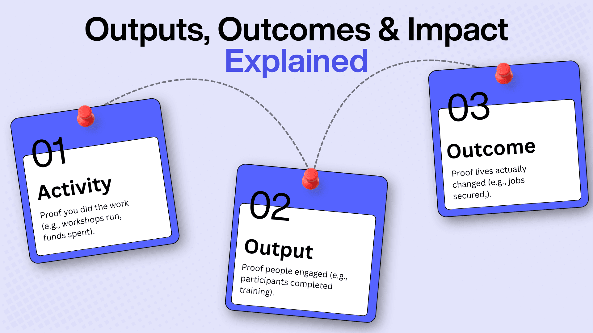
Not all metrics are equal. Most organisations spend their energy proving they were busy rather than proving they were effective. Here are the three tiers every measurement system needs.
Tier 1: Activity metrics: proof you showed up
The question they answer:_ Did we do the work?_
Examples: 42 training workshops conducted, 15 volunteers deployed, ₹12 lakh in program funds disbursed.
Why they're not enough: Doing a lot of things doesn't mean any of it landed. You can run a hundred workshops and change nothing if they're poorly designed or reach the wrong people.
When they're useful: To show a board you executed the operations you promised and can justify the spend.
Tier 2: Output Metrics: Proof People Engaged
The question they answer: Did people show up and participate?
Examples: 78% of enrolled participants completed the full training; 450 families received activated water-purification kits; 92 students graduated with certificates.
Why they're not enough: Completion isn't transformation. A student can finish a course and learn nothing. A family can receive a filter and never install it.
When they're useful: To show funders your delivery capacity and engagement rates.
Tier 3: Outcome Metrics: Proof Lives Changed
The question they answer: Are people better off because we were there?
Examples: 67% of graduates found jobs within four months, against a 23% baseline; waterborne illness fell 52% in program villages versus 8% in comparison areas; student maths proficiency rose from 34% to 71% over a year.
Why this tier is non-negotiable: It's the only one that proves real change. It's what donors fund, boards respect, and beneficiaries actually feel.
When to use it: Always. Outcomes should dominate your impact reports and grant proposals.
The Fatal Mistake: Building the Pyramid Upside Down
Most reports spend ~80% of their space on activities ("we held 60 workshops!"), ~15% on outputs ("450 women participated!"), and barely mention outcomes. Flip it.
Your next report should open with the change, not the effort:
"306 women moved out of poverty this year. A year on, 68% of the businesses they launched are still trading. We got there by running 60 workshops that 92% of participants completed."
Same facts. Completely different report. One proves you were busy; the other proves you mattered.
The three tiers at a glance
| Tier | Answers | Example (skills program) | What it proves |
|---|---|---|---|
| Activity | Did we do the work? | Number of training sessions held | You executed |
| Output | Did people engage? | Number who completed the training | You delivered |
| Outcome | Did lives change? | % who gained a job or promotion within 6 months | You had impact |
How to Measure Social Impact: The 3 P's Framework
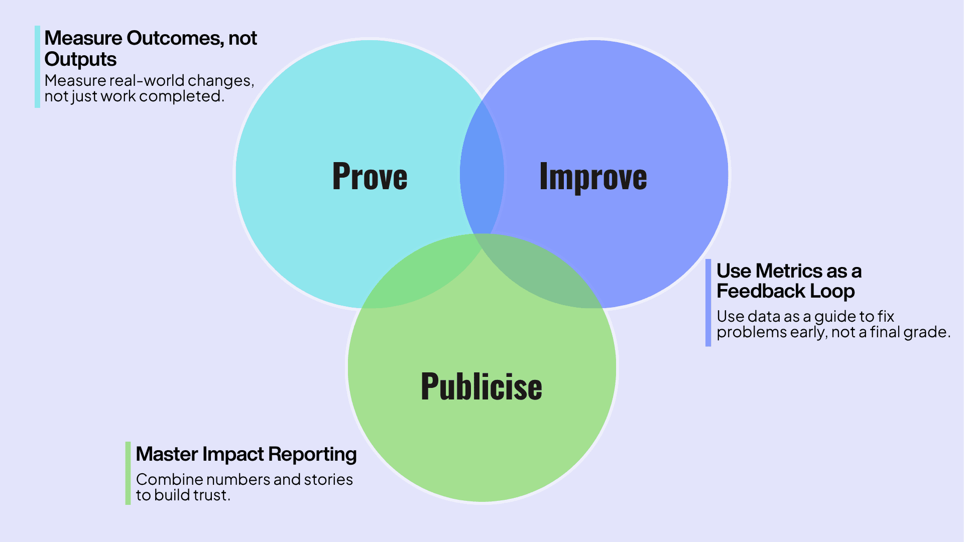
Understanding the difference between output and outcome is the what. The 3 P's are the how: a simple operating model I come back to on every engagement. Think of it less as a reporting template and more as a compass.
1. Prove: Measure Outcomes, not just Outputs
This is the load-bearing step. Move past what you produced to what changed.
- Outputs are what you make: 100 workshops run, 5,000 trees planted, 200 meals served. Easy to count, but they don't tell the story.
- Outcomes are the changes that follow: 70% of participants gained a skill, forest cover rose 10%, families had a week's food security.
Illustrative: a sanitation NGO in Maharashtra ran hygiene workshops (an output). By staying close to families and tracking the data, they showed those workshops drove a 15% fall in school absenteeism among girls (an outcome). That single shift from "we ran workshops" to "girls missed less school" is the whole game.
2. Improve: Treat Metrics as a Feedback Loop, not a Verdict
Measurement shouldn't feel like a punishment. It's a work compass: it tells you what's working, what isn't, and where to adjust while there's still time to adjust.
Illustrative: a rural water project in Rajasthan tracked how often its pumps broke down. The data revealed the local water's high mineral content was destroying components faster than expected. They switched to more durable materials, a fix they'd never have found without watching the numbers. Measurement didn't grade them; it saved the program.
3. Publicise: Master your Impact Reporting
Data earns trust; stories earn attention. The strongest social impact reporting fuses the two: a number that establishes scale, a story that gives it a face.
The point isn't to publish a fact sheet. It's to show a funder both that you get results and that you understand the human lives behind them. A report that does both feels alive. A spreadsheet never will.
Frameworks and Tools: Your Measurement Toolkit
You don't need a data-science team or a huge budget to start. You need the right framework to point you in the right direction. Here are the ones that actually matter, from a simple starter map to the global standards funders now recognise.
Quantitative vs. Qualitative: You need Both
| Metric type | What it captures | Example |
|---|---|---|
| Quantitative | The what / how many (numbers) | % of children attending school; households reached; rupees saved by a health program |
| Qualitative | The why / how (human experience) | "What's the biggest change in your life since joining?"; "Describe how your daily routine changed after the new toilet." |
Numbers give you scale and hard evidence. Qualitative data explains the number and often surfaces problems the number hides. Report only the number, and you sound like an audit; report only the story, and you sound like a brochure. The credible middle is both.
The Logic Model: Your Program on one Page
The Logic Model is a simple map connecting the small things you do daily to the big change you're chasing:
- Inputs: the resources you invest (volunteers, funds, equipment)
- Activities: what you actually do (tutoring, health camps)
- Outputs: the direct results (sessions held, people attending)
- Outcomes: short-to-medium-term change (better exam scores, improved hygiene)
- Impact: the lasting change (better livelihoods, lower disease rates)
If you're just starting, draw this first. Everything else hangs off it.
Theory of Change vs. Logic Model: What's the Difference?
People use these interchangeably; they're not the same.
A Theory of Change (ToC) is the high-level narrative of why your work leads to change; it makes your assumptions explicit and works backwards from the long-term goal ("if we do A, then B happens, because C").
A Logic Model is the tidy, visual, left-to-right table of that same logic.
Think of the ToC as the argument and the Logic Model as the diagram. Serious funders increasingly want the ToC, because it shows you've stress-tested your assumptions, not just listed your activities.
The Impact Management Project's Five Dimensions: the Shared Global Language
Between 2016 and 2018, the Impact Management Project brought together more than 2,000 practitioners to agree on how impact should be described. They landed on five dimensions now the closest thing the sector has to a common vocabulary (stewarded today by the Impact Frontiers community):
What: which outcome you're affecting, and how much it matters to the people experiencing it Who: who experiences it, and how underserved they are How Much: the scale, depth, and duration of the change Contribution: whether the change would have happened anyway without you Risk: the chance that impact doesn't play out as expected
If you're reporting to impact investors or large institutional funders, framing your data across these five dimensions signals real fluency.
IRIS+ The standardised metrics catalogue
Where the Five Dimensions tell you what to describe, IRIS+, managed by the Global Impact Investing Network (GIIN), gives you a free, standardised catalogue of how to measure it, mapped to the Sustainable Development Goals and aligned to those same five dimensions. Instead of inventing a metric for "improved livelihoods," you pull a shared, comparable definition. That comparability is exactly what funders deploying capital across many organisations are hungry for.
Social Return on Investment (SROI): Putting a Rupee Value on Change
SROI is a principles-based method for expressing the social, environmental, and economic value you create as a monetary figure, standardised by Social Value International. It answers a blunt question: for every rupee invested, how much social value did we create?
The core idea is a ratio:
SROI = Present value of the social value created ÷ Value of the investment
If ₹1 invested in a health camp produces ₹3 in avoided treatment costs and improved productivity, that's a 3:1 ratio. But the headline number is the least interesting part. A credible SROI rests on eight principles: **involve stakeholders, understand what changes, value what matters, only include what's material, don't over-claim, be transparent, verify the result, and be responsive. **
On four honest adjustments most weak studies skip:
Deadweight: what would have happened anyway, without you Attribution: the share of the change caused by other people or programs Displacement: impact that simply moved a problem elsewhere Drop-off: how the benefit fades over time
What counts as a "good" SROI ratio? Anything above 1:1 means you created more value than you spent, and nonprofit programs commonly land between 2:1 and 10:1. But here's the honest caveat most guides won't give you:
- Two SROI ratios are not comparable unless the studies used the same scope,
- Stakeholder definitions, and adjustments
Treat SROI as a disciplined story of value, not a league table. The evidence chain matters far more than the number on the cover.
Framework comparison: Which one, when?
| Framework | Best for | Effort | What it gives you |
|---|---|---|---|
| Logic Model | Getting started; internal clarity | Low | A one-page map from inputs to impact |
| Theory of Change | Grant proposals; testing assumptions | Medium | The why behind your logic |
| IMP Five Dimensions | Reporting to impact investors | Medium | A shared language to describe impact |
| IRIS+ | Comparability across programs/portfolios | Medium | Standardised, SDG-aligned metric definitions |
| SROI | Demonstrating value-for-money in rupees | High | A monetised value ratio + narrative |
Most organisations don't need all five. A practical path: start with a Logic Model, mature it into a Theory of Change, pull your metrics from IRIS+, and reach for SROI only when a specific funder wants a value-for-money case.
How to Design Your Impact Metrics (A 4-Step Method)
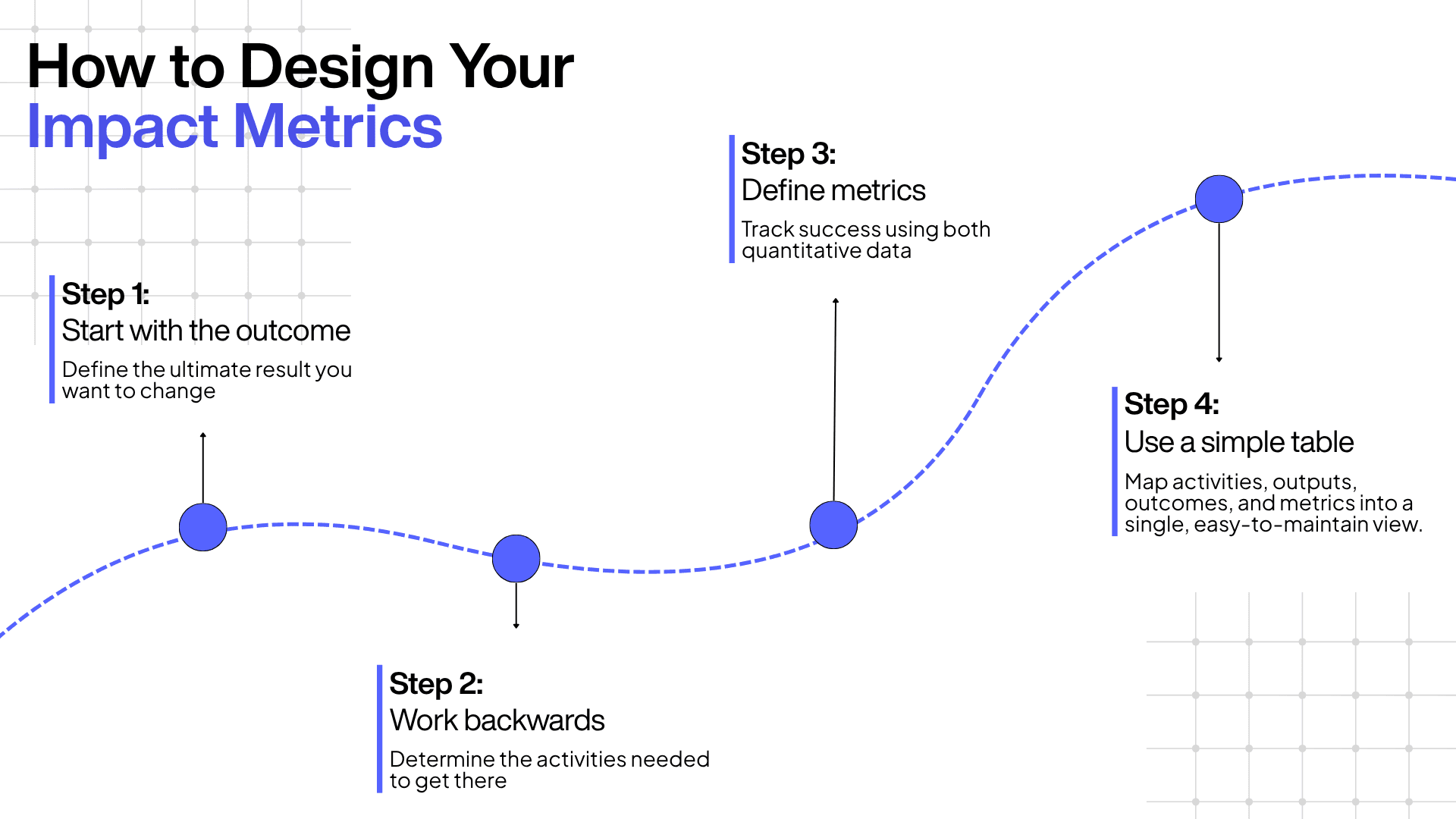
A blueprint is useless until you turn it into a working strategy. Designing good metrics isn't hard; it's mostly a matter of asking questions in the right order.
Step 1: Start with the outcome, not the activity: Ask what you want to change, not what you plan to do. The single most important result of the work. Example outcome: "Reduce the spread of waterborne disease in the community."
Step 2: Work backwards to your activities: What must you do to get there? Example activities: run sanitation workshops, distribute water filters, conduct house-to-house check-ups.
Step 3: Define one clear metric per outcome, quantitative and qualitative: Quantitative: track the share of households using a water filter, aiming to move from 10% to 75% over a year. Qualitative: capture a story: "My family used to fall sick every month; since the filter, not a single fever."
Step 4: Put it in a simple table: One view that shows activity, output, outcome, and how you'll measure each. If you can see it at a glance, you'll actually maintain it.
And the discipline that makes all of this work: pick the one outcome you'd stake the program on, and track it every single week for 90 days. You'll learn more from that one number, watched closely, than from twenty metrics reviewed once a quarter.
Social Impact Measurement Software & Tools
You genuinely don't need to spend big to start measuring: a notebook, a phone, and a free form will take you a long way. But as programs grow, the right platform saves enormous time and turns scattered data into something you can actually report. Here's an honest rundown, from free starters to full impact-management platforms.
Free and low-cost starters
- Google Forms: free, dead-simple surveys and questionnaires. Responses flow straight into Google Sheets, so it's the fastest way to collect beneficiary feedback and baseline data. Best for: getting started this week with zero budget. Watch out for: it's collection only; you'll still need somewhere to analyse and report.
- Airtable: a spreadsheet-database hybrid with far more structure than a plain sheet. Best for: small teams tracking beneficiaries, projects, and a mix of qualitative and quantitative data in one place. Watch out for: it can get pricey and unwieldy as records scale.
- Monday.com a visual work platform with custom boards for timelines, tasks, and status reporting. Best for: program and project coordination and clean status updates. Watch out for: it's built for work management, not impact measurement specifically.
Purpose-built impact and nonprofit platforms
- Relific.io: an AI-native platform built specifically for the social sector and CSR. Relific helps you manage programs, monitor field interventions in real time, and evaluate impact using data and leveraging AI analytics. This turns messy, disconnected field data into a clear picture of what's working. Best for: CSR teams and social organisations in education, healthcare, and tech that want measurement infrastructure that's ready for audited reporting. Watch out for: like any platform, it rewards teams who feed it consistent data.
- Salesforce Nonprofit Cloud: an all-in-one platform spanning fundraising, donor management, program delivery, and outcome tracking. Best for: larger, well-resourced organisations wanting a 360° view. Watch out for: significant setup, cost, and admin overhead.
- Sopact Impact Cloud: built around SROI, IRIS+, and stakeholder data collection. Best for: organisations running rigorous, standards-aligned measurement. Watch out for: a steeper learning curve for beginners.
- SocialCops (now Atlan): a data-intelligence platform strong in the Indian field context, turning fragmented field data into decisions. Best for: data-heavy field operations in India. Watch out for: aimed at data teams more than small NGOs.
Tool comparison at a glance
| Tool | Type | Best for | Starting cost |
|---|---|---|---|
| Google Forms | Data collection | Anyone starting from zero | Free |
| Airtable | Spreadsheet-database | Small teams, mixed data | Free tier |
| Relific.io | AI impact platform | CSR & social-sector measurement | Paid (demo available) |
| Salesforce Nonprofit Cloud | All-in-one CRM | Large organisations | Paid |
| Sopact Impact Cloud | Impact/SROI platform | Standards-aligned measurement | Paid |
| SocialCops / Atlan | Data intelligence | Indian field data at scale | Paid |
My honest advice: don't buy software to look serious about measurement. Buy it when your data volume has outgrown a spreadsheet, and you can commit to feeding it weekly. A free form used with discipline beats an expensive platform used out of guilt.
A Real Social Impact Measurement Example: The Educate Girls Development Impact Bond
Most "case studies" in this space are vague or invented. This one is neither; it's independently verified and thoroughly documented, and it's the single clearest illustration of measurement done right in India.
In 2015, the NGO Educate Girls launched the world's first Development Impact Bond (DIB) in education, in the Bhilwara district of rural Rajasthan. The structure tied funding directly to results: the UBS Optimus Foundation put up US$270,000 in upfront capital, Educate Girls delivered the program, and the Children's Investment Fund Foundation (CIFF) agreed to repay the investor with a return only if agreed outcomes were met. It was judged on two things: enrolling out-of-school girls, and improving learning for both girls and boys. Results were verified independently by IDinsight using a randomised controlled trial.
Measurement as a compass, not a report card. The most important part of the story is what happened mid-program. After two years, enrollment was on track, but learning gains were still lagging. Because the model measured continuously, the team saw the problem in time and pivoted to a more child-centric curriculum. That decision, driven by honest data, is exactly what "Improve" looks like in practice.
The results. By its final year in 2018, the DIB surpassed both targets: 116% of the enrollment target (768 out-of-school girls enrolled) and 160% of the learning target. Students in program schools showed learning gains roughly 79% higher than their peers, close to an entire additional year of instruction. CIFF repaid UBS its principal plus a 15% internal rate of return. Crucially, the program reached over 7,300 children across 166 schools in 140 villages, and every headline number was externally verified.
The lesson isn't "run a Development Impact Bond." Most organisations won't and shouldn't. The lesson is this: measurement is most valuable when it's continuous enough to change your decisions while the program is still running. Educate Girls didn't measure to write a nicer report at the end. They measured to fix the program in the middle, and that's why the ending was worth writing about.
Common Challenges in Social Impact Measurement (and How to Avoid Them)
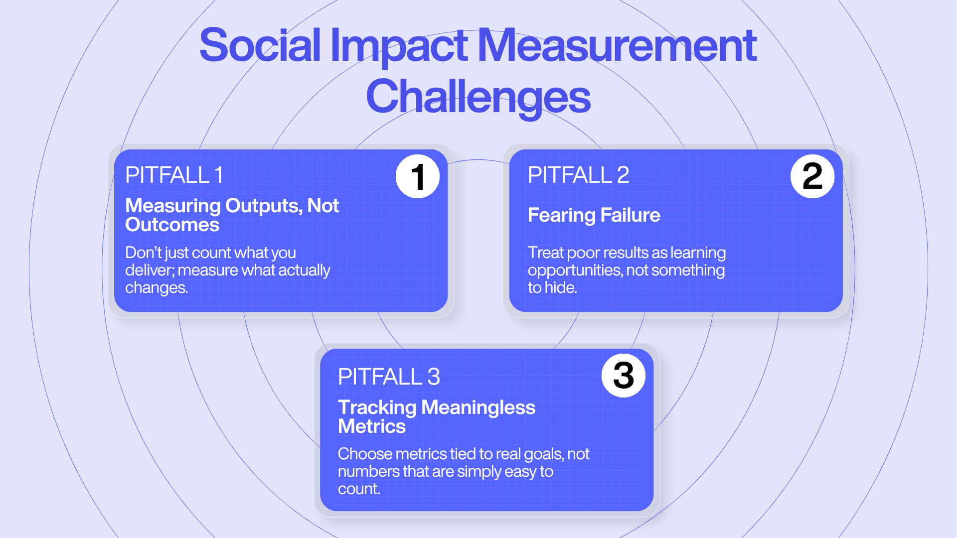
Even with good intentions and the right tools, this work has predictable traps. Knowing them ahead of time is half the battle.
Pitfall 1: Measuring outputs instead of outcomes
The classic mistake is confusing what you did with what you achieved. A project reports "we built 100 toilets," but if the toilets go unused, the intended outcome (better hygiene and health) never arrives.
How to avoid it: Before you start, ask "if we do this, what will change?" Then measure the change ("what percentage of households now use the new toilets?"), not just the deliverable.
Pitfall 2: Fearing failure and missing the chance to learn
Nobody wants to admit a program isn't working, so many organisations quietly avoid measuring outcomes that might look bad. Hiding from the truth is the surest way to fail slowly.
How to avoid it: Treat measurement as learning, not judgment. When a literacy NGO finds attendance is high, but learning is flat, that's not a failure; it's the most useful thing they'll learn all year. The organisations that grow are the ones that own the awkward number and redesign around it.
Pitfall 3: The meaningless metric
A metric only matters if it connects to a real goal. An NGO that proudly reported "number of pamphlets distributed" realised too late that almost no one read them. The number was easy to count and told them nothing.
How to avoid it: Every metric should answer a specific question about your impact. In that case, tracking engagement with a WhatsApp audio campaign would have mapped directly to the real goal: getting information to people. Always ask: does this number actually reflect our mission's progress?
India's Regulatory Reality: CSR Law and the Social Stock Exchange
If you operate in India, measurement isn't just good practice anymore; the rules have changed underneath the sector. Two things you need to understand.
The CSR Mandate
India is the first country in the world to make CSR spending mandatory, under Section 135 of the Companies Act, 2013. Qualifying companies must spend at least 2% of their average net profits on eligible social activities. That single law is why more than ₹2.61 lakh crore has flowed into the sector and, increasingly, why boards and CSR heads want proof that the money did something. Compliance opened the tap; measurement is becoming the condition for keeping it open.
The Social Stock Exchange (SSE): Measurement as the Price of Entry
The most consequential development in Indian social finance is the Social Stock Exchange, a separate segment of the recognised stock exchanges (it operates on both the NSE and BSE), regulated by SEBI, that lets social enterprises, nonprofits and for-profits raise funds from the public. First floated in the 2019-20 Union Budget, it received SEBI's assent in December 2022.
Here's why it changes everything for measurement. To list and raise funds on the SSE, an organisation must produce a regularly audited Annual Impact Report (AIR). Under SEBI's September 2025 framework, those reports for fund-raising entities must be assessed by empanelled Social Impact Assessment Organisations, must cover at least 67% of the organisation's programme expenditure, and must be filed by 31 October each year (or the income-tax return due date, whichever is later). The 2025 reforms also widened which nonprofits can register (trusts, societies, and Section 8 companies with a valid 12-month registration), and the minimum investment in Zero Coupon Zero Principal Instruments was cut to just ₹1,000 to bring in retail donors.
As of early 2025, over 115 NGOs had onboarded the NSE's SSE and 51 the BSE's. The signal is unmistakable: social impact measurement has moved from a voluntary line in a CSR report to a regulated requirement for accessing serious capital. Organisations without measurement infrastructure are, increasingly, simply not fundable at scale. This is exactly the shift Relific was built for: turning measurement from a scramble before a funder deadline into infrastructure that's always audit-ready.
The Future of Social Impact Measurement: AI, Blockchain, and Radical Transparency
Technology isn't just changing how organisations report; it's changing what's even possible to measure. The direction of travel is away from box-ticking compliance and toward continuous, verifiable transparency.
AI for Qualitative Analysis at Scale
The old trade-off was brutal: quantitative data was scalable but shallow, qualitative data was rich but impossible to analyse at volume. AI is dissolving that trade-off. It can now read thousands of beneficiary interviews, open-ended survey responses, and field notes to surface what people actually feel, moving past "how many did we help?" to "do people feel more secure about the future?" This is the frontier we work on at Relific: keeping the human texture of qualitative data while making it analysable across an entire program.
Blockchain for Tamper-Proof Reporting
One of the hardest problems in doing good is proving the money reached its destination. Blockchain creates a public, unchangeable record of transactions a digital paper trail that can't be quietly edited. Initiatives around India's Social Stock Exchange are exploring exactly this kind of traceability, which builds a level of donor trust that a PDF report never could.
From Compliance-Driven CSR to Impact-Driven Transparency
The deepest shift is from complying to proving. Compliance-driven CSR is a legal requirement met once a year. Impact-driven transparency is an ongoing demonstration, backed by real data, that you're creating change. And it's becoming a competitive advantage: organisations that can prove their impact will attract the customers, investors, and talent who increasingly choose where to spend, invest, and work based on it.
The most successful organisations of the next decade won't just be the ones that spend the most. They'll be the ones that can show they changed something, and technology is finally giving everyone the tools to do it.
Getting Started: Your First 90 Days
You now have the full picture. Here's the honest truth about where to begin: not with a complex system, but with a single question: are we actually making a difference?
You don't need to get everything perfect from day one. You need to:
- Pick one outcome you'd stake the program on.
- Choose one quantitative metric and one qualitative story to track against it.
- Draw a one-page Logic Model so everyone can see how the daily work connects to that outcome.
- Track it weekly for 90 days; a free form and a spreadsheet are enough to start.
- Act on what you find. If the number is disappointing, that's not failure; that's the most valuable thing you'll learn this quarter.
The truth you uncover will do two things: make you better at the work, and hand you the most powerful, credible story you could ever tell a funder.
Ready to build a CSR initiative that delivers provable results? If your organisation is ready to formalise its impact measurement and make it audit-ready, book a consultation with Manjunatha Thyagaraj.
Frequently Asked Questions
What is the difference between outputs, outcomes, and impact?
Outputs are what you produce (workshops held, filters distributed). Outcomes are the changes that result (skills gained, illness reduced). Impact is the long-term, lasting change that addresses the root problem (better livelihoods, lower disease rates). Funders increasingly pay for outcomes and impact, not outputs.
What does SROI stand for?
SROI stands for Social Return on Investment, a principles-based framework, standardised by Social Value International, that expresses the social, environmental, and economic value created relative to the resources invested, usually as a ratio (for example, 3:1).
What is a good SROI ratio?
Any ratio above 1:1 means you created more social value than you spent, and nonprofit programs commonly range from 2:1 to 10:1. But there's no universal benchmark; ratios aren't comparable across studies unless they used the same scope and assumptions. The quality of the evidence matters far more than the headline number.
Do I need a big budget to measure social impact?
No. You can start with free tools like Google Forms and a spreadsheet. The essential ingredient is a clear plan: one outcome, tracked consistently, not expensive software. Small organisations often measure impact more authentically because they're closer to the communities they serve.
Is social impact measurement necessary for a small nonprofit?
Yes. It's not about producing complex reports; it's about learning and improving. Starting simple, tracking one outcome well helps you prove your value to donors and adapt your strategy faster. For small organisations, it's often the difference between renewed funding and a polite decline.
How often should I measure impact?
It depends on the program, but measure often enough to change your decisions while there's still time to act. Continuous or quarterly tracking of key outcomes lets you use data to improve, rather than only reporting on it at the end the very reason the Educate Girls DIB succeeded.
What is a Theory of Change, and how is it different from a Logic Model?
A Theory of Change is the high-level narrative explaining why your work leads to the change you want, making your assumptions explicit. A Logic Model is the tidy, visual map of that same process (inputs → activities → outputs → outcomes → impact). The ToC is the argument; the Logic Model is the diagram.
What are the best free tools for social impact measurement in India?
Google Forms (free surveys that feed into Google Sheets) and Airtable (structured tracking) are strong starters. WhatsApp works well for quick beneficiary feedback in the field. As programs scale, purpose-built platforms like Relific.io add real-time monitoring and AI analytics suited to the Indian context.
What's the biggest mistake organisations make in measuring impact?
Measuring activities instead of results, celebrating how busy they were rather than proving anything changed. Close behind are fearing honest reflection (avoiding metrics that might look bad) and tracking "meaningless metrics" that are easy to count but disconnected from the mission.
Is impact measurement legally required in India?
For accessing certain capital, effectively yes. To raise funds through the Social Stock Exchange, organisations must file an audited Annual Impact Report assessed by an empanelled assessment organisation, covering at least 67% of programme expenditure. It has moved from best practice to a regulated requirement for serious fundraising.